ShopDreamUp AI ArtDreamUp
Deviation Actions


Suggested Deviants


Suggested Collections


You Might Like…


Featured in Groups


Description
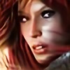
This image is a little different from my usual,i've tried to do a little work of style on realism and detail so...hope you like it!
Base character and base texture rendered in Poser,all the rest created in Photoshop as always.
Here the base renders used[link]
Credits to:
Cloth Textures Pack 1 by ~ALP-Stock(free on DA):
[link]
Tribal brush Megapack by narvils(free on DA)
[link]
Tribal Brushes by =Falln-Stock(free on DA)
[link]
Dragon Brushes by indodreamin(free here on DA)
[link]
Brush Pack-Japanese Floral by MouritsaDA-Stock(free on DA)
[link]
Image size
1600x1556px 484.55 KB
Mature
© 2012 - 2024 supermarioART
Comments108
Join the community to add your comment. Already a deviant? Log In
This picture is great!
It is to my mind a rather unconventional posing, not showing the front but the back of a beautiful girl <img src="e.deviantart.net/emoticons/w/w…" width="15" height="15" alt="
Special attention goes to the clothing here! It turned out awesomely breathtaking in its design, I really like it very much. The idea of having long parts of skin shown and topping the borders with lace and delicate chains is well thought and nicely placed.
The fact that you used a 3D-model as base is barely visible, which I appreciate a lot. Only by looking at the hands, the face or by zooming in this is visible, so you did a really good job in painting over! It's my favourite part of this picture!
The idea of using ornament in general is nice, but to me you overdid it slightly. The background is a little uneasy with the big ornament in the circle plus the 3D-looking wood panels. I'd maybe sticked to monochrome colours instead of mixing purplish, silver and gold-yellowish. Th focus would have been more on the girl's back then, not distracting the eye of the viewer too much, still using an impressing ornament to the door or wall she is standing in front of.
Keep your work up!